Belgrade, Serbia
MR DESIGN STUDIO ®
Industrial Design · Graphic Design · 3D Modeling & 3D Rendering · 3D Animation · Website · Marketing · VR ·
Belgrade, Serbia
Be recognized.
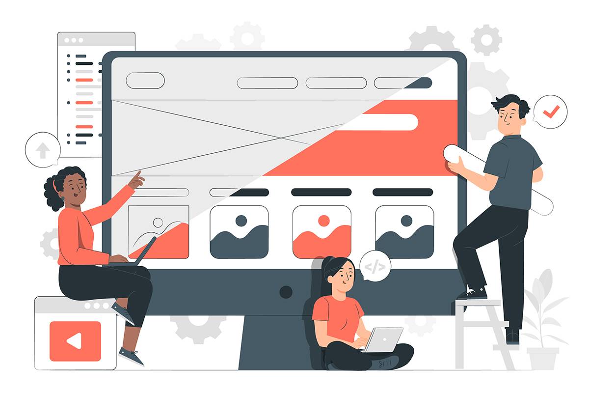
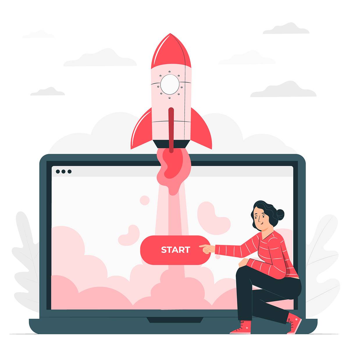
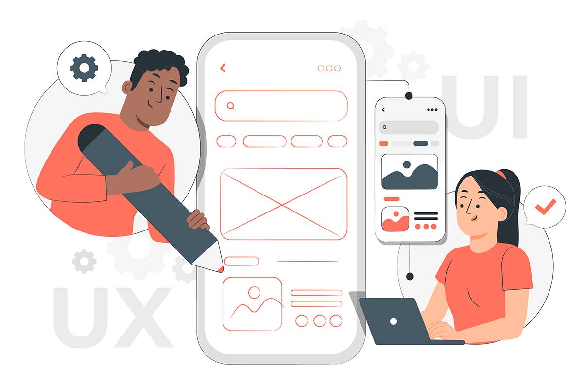
A landing page, a product of the digital age, represents the virtual storefront of your brand, product, or service. This isn't just an ordinary website; it's a place where words and design come together to create an experience that guides visitors toward a specific goal or action.
It's not just a presentation tool; it's a powerful conversion tool. . Through strategically placed elements, this page has the ability to transform ordinary visitors into loyal customers. The importance of a landing page is reflected in its potential to provide the first impression that leaves a lasting impact on visitors' minds.
The goal of these pages is direct sales of products or services. Where words become action. "Buy now and experience transformation!"
A landing page is not just a showcase but also a tool for collecting information. Set up a signup form for a free webinar or to download useful materials. Here's an example: "Subscribe now and get a free $50 digital marketing guide! "
Here, the landing page becomes a crucial tool for building a base of potential clients.
Visitors are provided with more information to motivate them to click on a specific link. But it's not just a click; it's a journey to more information. For example, "Click and discover the secrets of our product."
These are intended for collecting registrations for events. For example, "Join us for an exclusive webinar. Enter your details and reserve your spot."
Instead of a plain "Buy now," the headline could be "Discover the secret of perfect style: Buy our shoes and be irresistible." Here, a clear headline and subheadline immediately grab attention and convey value.
Instead of a boring "Sign up," the CTA could be "Start your journey to success: Sign up now and gain exclusive access." Clearly highlighting benefits and creating a sense of exclusivity increases the chances of conversion.
Instead of ordinary product images, use a picture of a person wearing the shoes in real life with a smile on their face. Add a video testimonial from users. Such visual stories help visitors emotionally connect with the product or service.
Minimalistic design isn't just an aesthetic choice; it's a strategy that makes it easier for users to find information. "Simple but effective - because time is precious."
The landing page must be adapted for different screens (tablets, phones, laptops).
Branding isn't just a logo; it's a promise. It's about maintaining tone and style across all elements.
Colors aren't just visual decoration; they're an emotional language. "Red for passion, blue for trust, etc."
"Test, learn, adjust - that's the recipe for landing page success."
UInstead of static design, constantly testing different variations helps identify the most effective elements. For example, "We tested two headlines and found that 'Experience the Difference' generates 20% more conversions than 'Buy now,' so we kept it as a key component."
The headline is the first image of your story. The headline should immediately convey the basic message of the page, avoiding confusion.
Using relevant keywords improves SEO and helps visitors find what they're looking for. For example, "Best Shoes for Active Professionals - Buy Now and Enjoy in Comfort."
Using words that create a sense of urgency motivates visitors to take quick action. . For example, "Exclusive Offer - Only Today! Secure Your Copy."
Words that drive action, not just describe. "Transform your life - Click for instant changes!"
Not just what you offer, but also what it brings. . "Order now and relieve stress - Free shipping for all customers!" or "Join an exclusive community and enjoy special discounts every week."
Using words like "exclusive" or "members-only" can increase the desire for action. For example, "Access exclusive content only for our loyal readers. Sign up now!"
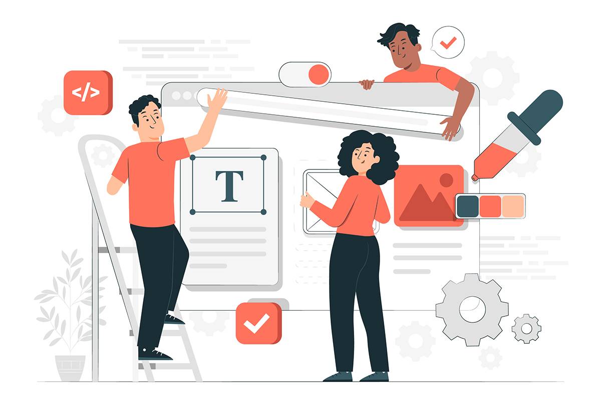
PAppealing images that reflect the brand's values increase the attractiveness of the page. A picture is worth a thousand words, but only if it's the right one.
Videos provide dynamism and additional information, maintaining visitors' attention. For example, a video testimonial from users about their experience with the product.
Numbers don't have to be boring. Graphic representations of information make it easier to understand complex concepts. . For example, an infographic showing the steps to using the product.
It's not just about the product; it's about solving the problem. It's not just about the product; it's about solving the problem.
For example, "Tired of uncomfortable shoes? Discover a game-changing design."
Highlighting the benefits of the product or service increases the offer's appeal.
Not just features, but also benefits. "Lightweight yet warm - Our jacket provides the perfect blend of style and comfort."
Poor example: The jacket weighs so and so grams and is made of such and such materials.
Writing stories about users or the brand increases emotional connection with visitors.
It's not just words; it's a story. "Learn how John found his perfect pair of shoes - His success story."
More than words, these are experiences. "Listen to what our customers are saying."
Positive experiences from other users provide social proof and help build trust.
Clear information about security measures and privacy policies provides a sense of safety.
It's not just a transaction; it's trust. "Our customers' security is our priority - Discover how we protect your data."
Open communication about return policies or guarantees builds trust among consumers.
It's not just a rule; it's an agreement. "Check out our return terms - Open and fair."
Numbers aren't just figures; they're answers. ". "Analyze performance with Google Analytics - Find out what your audience really wants."
Understanding how visitors interact with the page helps identify weak points. For example, "We noticed that a larger number of visitors are leaving the page during the registration step, so we decided to improve that part of the process."
It's not just a click; it's a journey. "Track your visitors' steps - Identify what keeps them engaged."
It's not just about numbers; it's about evolution. "Learn from data and grow - Your page is a living organism that adapts."
For example, "After conducting A/B testing, we noticed that the headline 'Feel the Difference' generates 30% more conversions, so we kept it as a key component."
An overcrowded design can distract users. Simplicity is key.
It's not just design; it's an experience. Every image and word should be carefully chosen to provide a unique experience.
Ignoring mobile optimization can result in losing visitors. Keep in mind that it's not just a mobile device; it's part of your everyday life.
If visitors aren't sure what to do next, conversion is jeopardized.
It's not just a form; it's a dialogue.
Long or complicated forms can deter visitors. Keep them simple and quick to fill out.
A landing page is never "finished." Regular testing and improvement ensure its effectiveness.
It's not just a fashion runway; it's a market that breathes. "Stay ahead - Keep up with current trends and adapt to your visitors' needs."
User feedback is invaluable. Actively listening and responding to it improves the user experience.
Now that you've stepped into the world of landing pages, remember that this is just the beginning. Your page is like a garden that needs constant watering and care. Through simple design, compelling storytelling, and ongoing trend monitoring, your landing page becomes a digital oasis that attracts and retains visitors. Good luck on your journey to endless conversions!
If you need help, reach out to one of the professional web design agencies.